
Unfortunately, TFS doesn’t have ready-made or easily accessible metrics charts like I’m used to with Jira. There is a lot of clicking and waiting, in my experience. Queries have to be created then assigned to widgets then added to dashboards. Worse, sometimes things I need just aren’t available. For example, there is no cycle time chart built into TFS. There is a plug-in available for preview for VSTS, but as of this posting that plugin won’t be available for TFS. With Jira, cycle time and other charts are available and easily accessible out of the box.
Sigh. Nonetheless, we go to work with the tools we have. And if need be, we build the tools we need. In this post, I’ll give a high level description for how to create Cycle Time charts from TFS data using Python. I’ll leave it as an exercise for the reader to learn the value of cycle time charts and how to best use them.
To make life a little easier, I leveraged the open source (MIT License) TFS API Python client from the Open DevOps Community. To make it work for generating Cycle Time charts, I suggested a change to the code for accessing revisions. This was added in a subsequent version. For the remainder of this post I’m going to assume the reader has made themselves familiar with how this library works and resolved any dependencies.
OK, then. Time to roll up our sleeves and get to work.
First, let’s import a few things.
import csv
from requests_ntlm import HttpNtlmAuth
from tfs import TFSAPI
import numpy as np
import matplotlib.pyplot as plt
With that, we’re ready to make a call to TFS’s REST API. Again, to make things simple, I create a query in TFS to return the story cards I wish to look at. There are two slices I’m interested in, the past three and the past eight sprints worth of data. In the next block, I call the three sprint query.
# Anything in angle brackets "<>" is a placeholder for actual values.
# I keep the values in this block in a configuration file and load
# them when the script runs.

if __name__ == "__main__":

    project = TFSAPI("{}".format("<server_url>"), project="<Collection/Project>", user="<user>", password="<password>", auth_type=HttpNtlmAuth)

    query = project.run_query('My Queries/Last3Sprints')
With the result set in hand, the script then cycles through each of the returned work items (I’m interested in stories and bugs only) and analyzes the revision events. In my case, I’m interested when items first go into “In Progress,” when they move to “In Testing,” when they move to “Product Owner Approval,” and finally when they move to “Done.” Your status values may differ. The script is capable of displaying cycle time charts for each phase as well as the overall cycle time from when items first enter “In Progress” to when they reach “Done.” An example of overall cycle time is included at the end of this post.
When collected, I send that data to a function for creating the chart using matplotlib. I also save aside the chart data in a CSV file to help validate the chart’s accuracy based on the available data.
It’s a combination scatter plot (plt.scatter), rolling average (plt.plot), average (plt.plot), and standard deviation (plt.fill_between) of the data points. An example output (click for larger image):
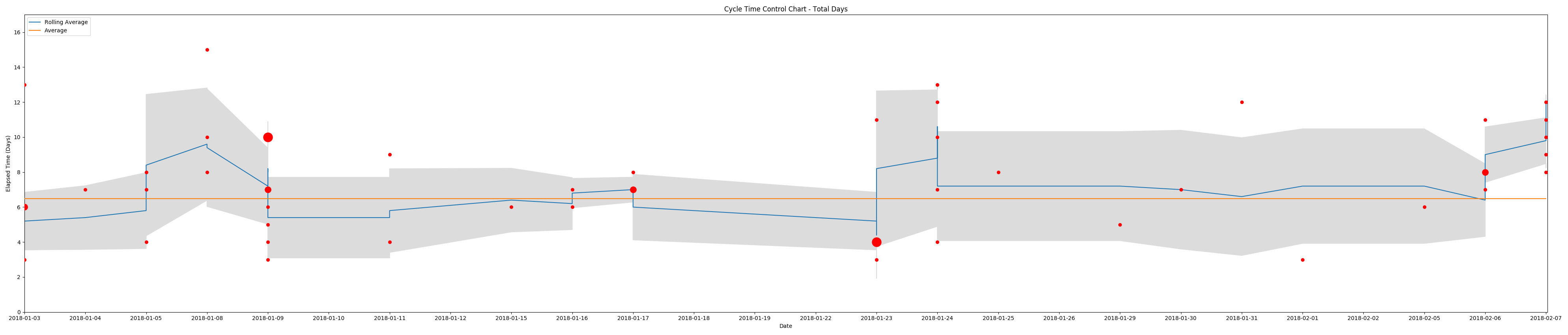
The size variation in data points reflects occurrences of multiple items moving into a status of “Done” on the same date, the shaded area is the standard deviation (sample), the blue line is the rolling average, and the orange line is the overall average.
If you are interested in learning more about how to implement this script in your organization, please contact me directly.